01

Mountain Minerals Water, 500 mL — the wordmark in its own landscape.
A self-initiated bottled water brand. One wordmark, and a series of illustrated labels — a different landscape on every bottle.
AquaFlow started as a personal exercise: take the most generic object on a shelf — a 500 mL water bottle — and make it something a person would want to keep. The answer turned out to be the label.
Mountain Minerals Water, 500 mL — the wordmark in its own landscape.
The wordmark carries the idea in two halves — a clean geometric sans for Aqua, a wet brush script for Flow. Still water and moving water in one lockup. Everything else on the bottle stays quiet so the illustration has room to work.
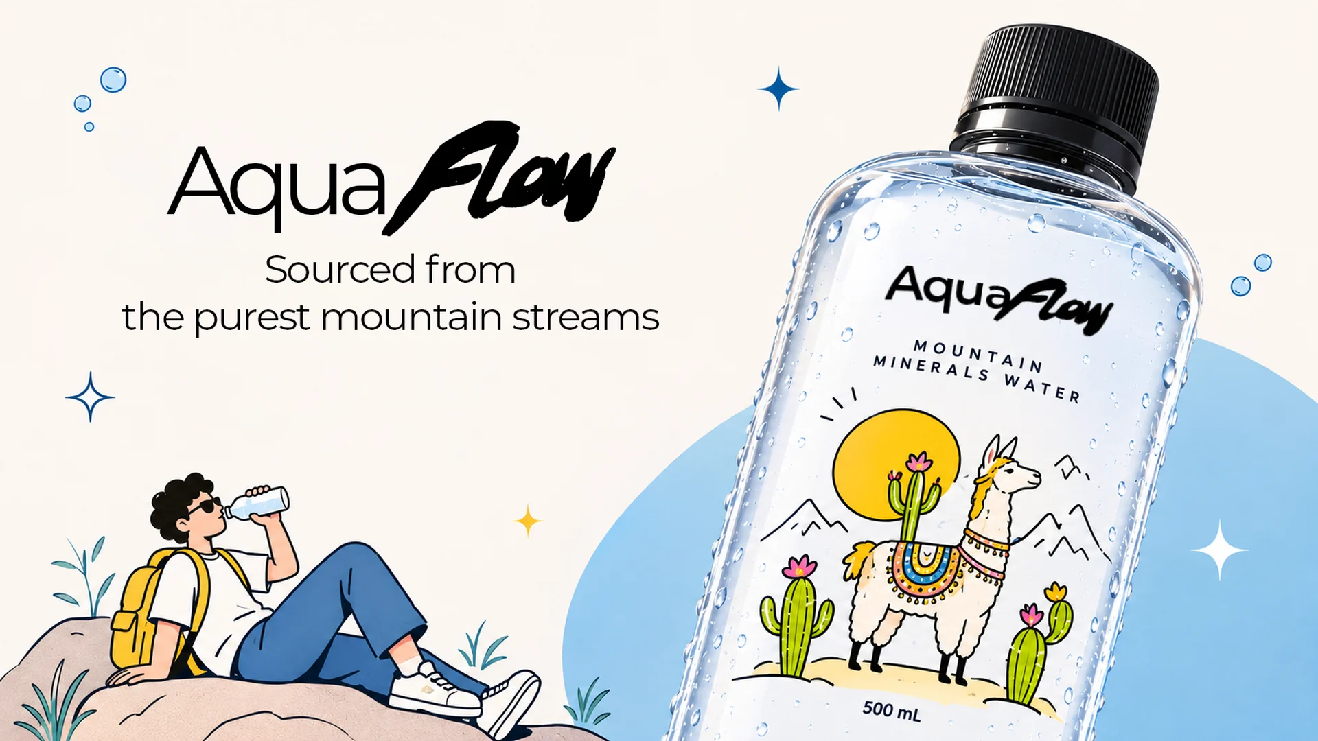
A llama in the Andes, a hiker in the pines, a village by the sea — same grid, same type, different place.
Running the label as a series rather than a single locked design means the shelf does the selling. Six bottles side by side read as a set, and the empty one on a desk stops looking like rubbish.
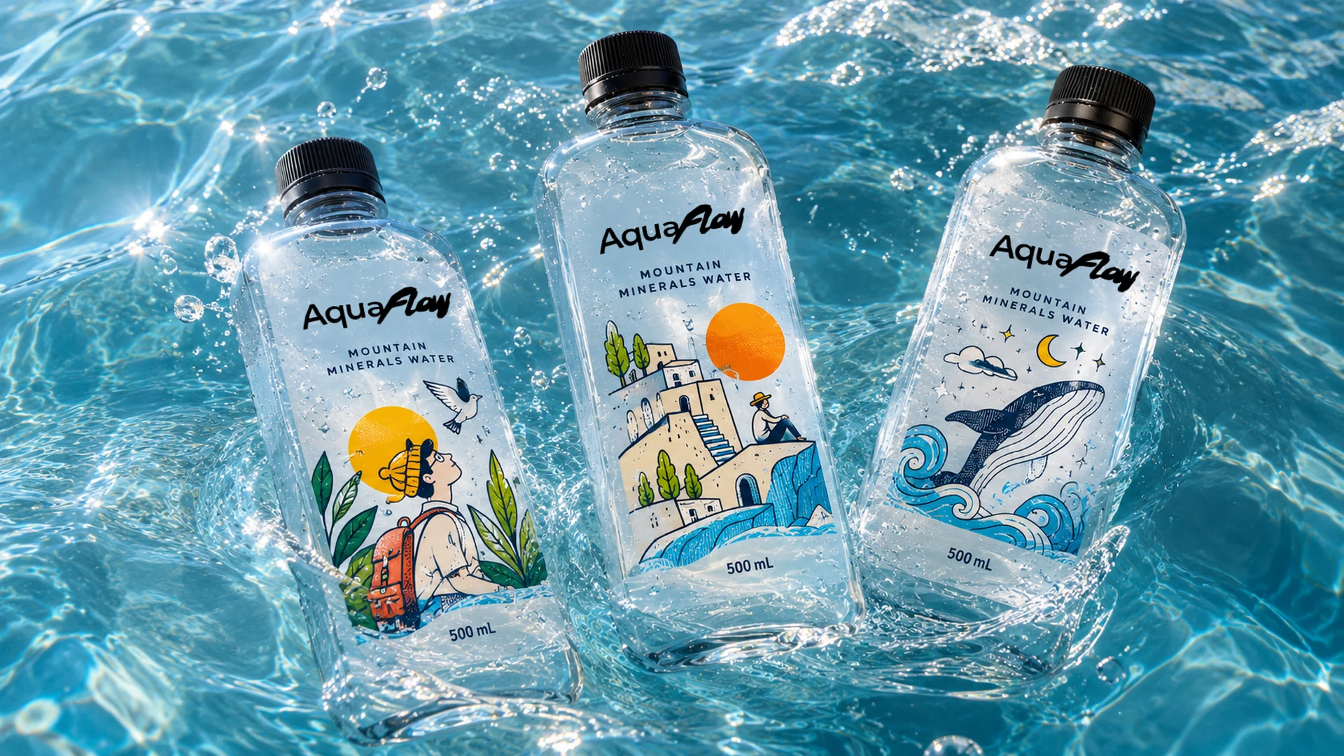
Three of the series together — the set is the point.
No client, no brief, no sign-off. That is the whole reason the label series survived — it is the sort of idea that gets negotiated away early, and here there was nobody to negotiate with.